Define
Client—
Fruity Boba is a conceptual boba tea shop based in California. They aim to connect to younger generations with fresh and playful visuals that align with their flavorful fruit-based beverages.
Challenge—
Design an engaging branding package for a boba tea company and create marketing to utilize it for their target audience.
Solution—
- Define an engaging brand identity that aligns with Fruity Boba’s goals.
- Create marketing assets that utilize their brand identity and align with their target audience.
Tools—
- Illustrator
- Photoshop
- Canva
See Final ProjectResearch
When it comes to making a brand connect, it is important to consider both the consumer and the company. How can we show who the company is and why should anyone be interested in them? To answer those questions, we need to take a look into the consumer and competitive market.
Consumer Insights—
- Women and men are both likely to buy boba tea, with a lean toward women
- The primary consumer base is Gen Z and younger Millennials with some interest from Gen Alpha
- Influenced by social media and pop culture to try new things
- Fruit and other experimental flavors are popular, both regularly and out of curiosity
- Seek out alternatives to highly caffeinated beverages such as coffee
Competitive Analysis—
I looked into three major competitors in the boba tea market and here is what I found:
Gong cha
- Variety of flavors and types of beverages
- Sans-serif fonts with occasional serif fonts
- White and red palette
- Classy and sophisticated design
- Seasonal flavor rotation
- Strong social media presence
- Collabs related to pop culture
Chatime
- Standard and fruit flavors with other types of beverages
- Thick sans-serif paired with fun accent fonts
- White, purple, and orange palette
- Colorful and playful design
- Wavy and round design elements
- Brand charms and plushies
- Utilizes plain color backgrounds
CoCo Bubble Tea
- Fruit flavors and various other beverages
- Thick and thin sans-serif font pairing
- White and orange palette
- Playful and clean design
- Colorful mascot
- Wavy design elements
- Uses drawn graphics
- Collabs related to pop culture
Now that I gathered some background information, I created some goals to steer me in the right direction.
Design Goals—
- Wavy patterns add fun movement to draw the eye and round elements to relate to the product
- Fun splashes of color with a natural base to reference both the tapioca pearls and fruity flavors
- Round, playful sans-serif font to encourage positive feelings
- Utilizing fruit to emphasize the fruit-based flavors the shop is specialized in
Concepts—
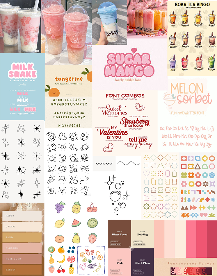
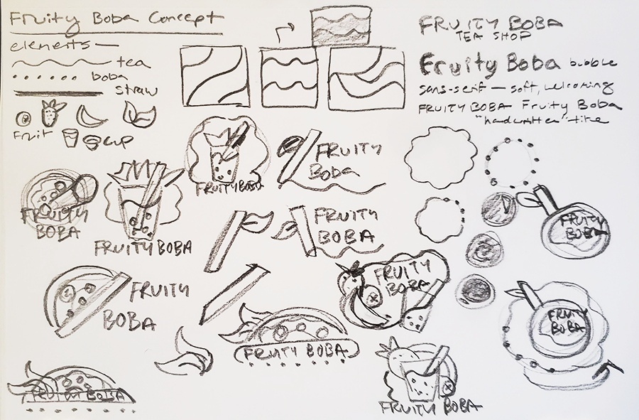
With my design goals in mind, I started with a moodboard and then moved on to sketching ideas. I took inspiration from "aesthetic" tea photos and the idea of using stickers and other decorations to add a personal touch.
Design
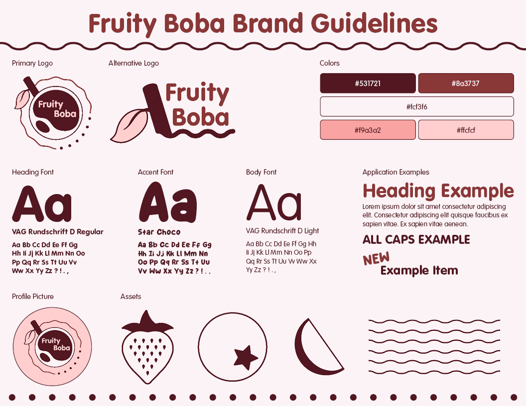
Before creating any designs for the final mockups, I created a branding guideline sheet to reference.
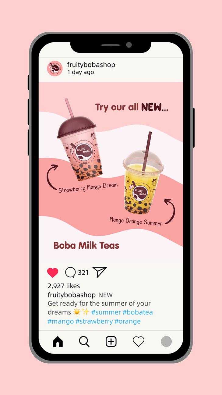
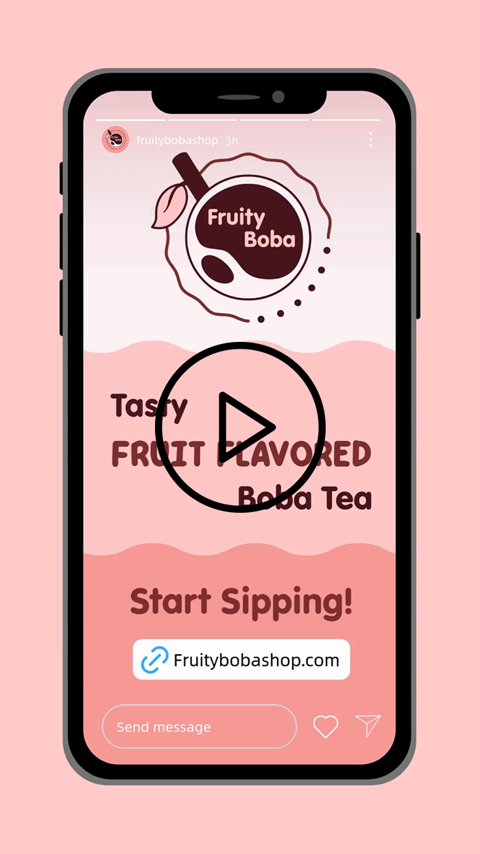
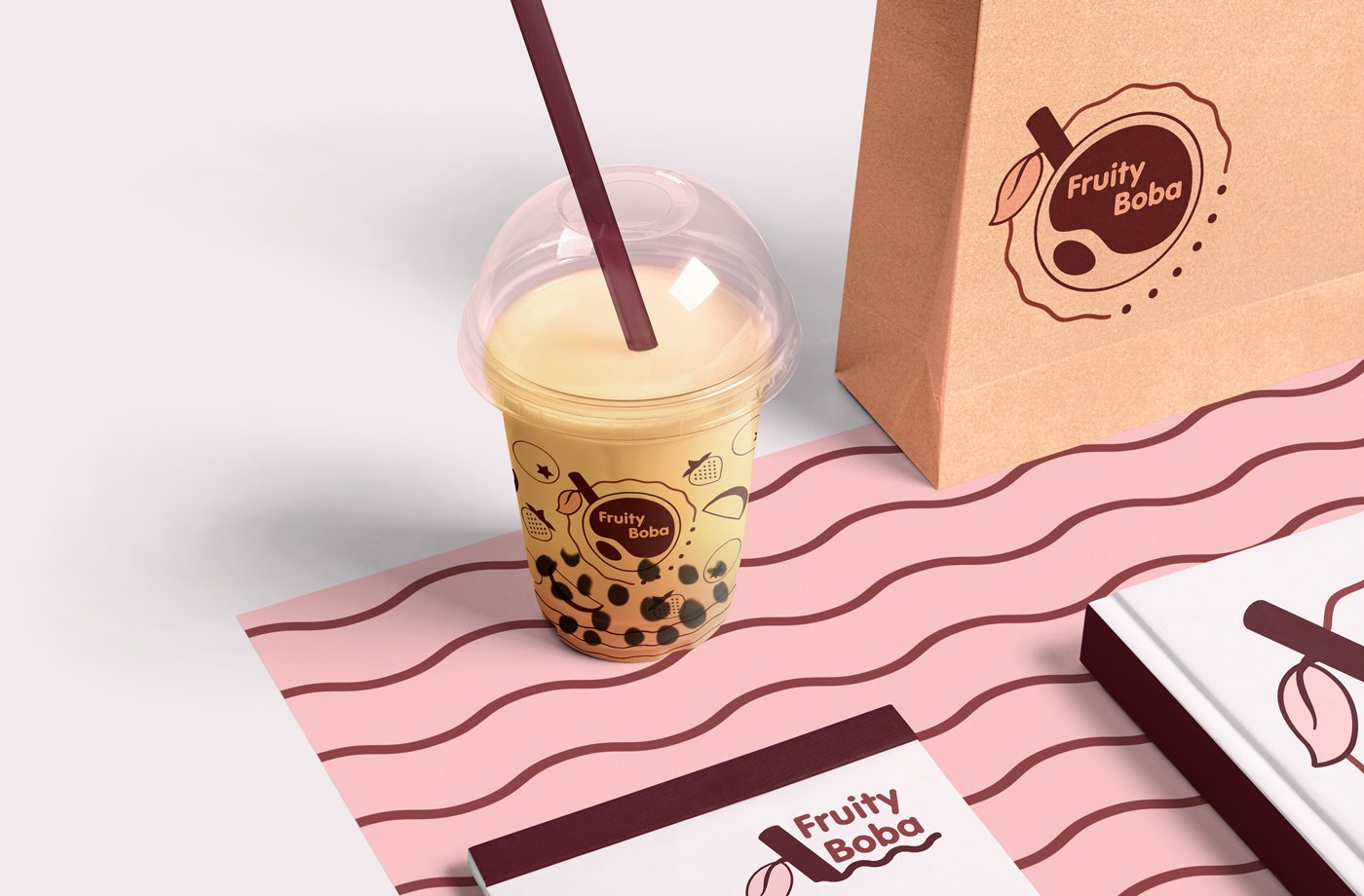
For the final mockups, I focused on Instagram to create a promotion post to bring awareness to new products and a story with a call to action link to connect consumers to the shop. There is also a mockup for a potential product spread.
Reflection
Overall, I had a lot of fun working on this project! Finding ways to incorporate different elements of the product into the designs was exciting, even when it got challenging.
Project Takeaways—
- Small changes like flipping the location of a design element make a big difference.
- The first sketch is often way different than the final product but is an important step in the right direction.
- Taking the consumers and competition into consideration can help figure out what is currently working.
Back To Work